grid-template-columns の コピペ用レシピ集。repeat()・auto-fit/auto-fill・minmax() の定番式と失敗しがちなポイントを 早見表→短解説 の順にまとめています。
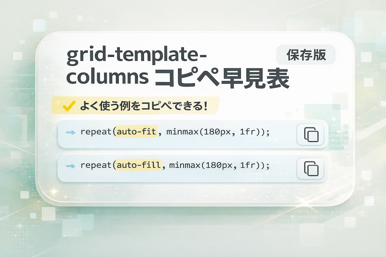
早見表(コピペ可)
3列固定
grid-template-columns: repeat(3, 1fr);自動折返し(最小180pxを維持)
grid-template-columns: repeat(auto-fit, minmax(180px, 1fr));比率で2:1
grid-template-columns: 2fr 1fr;最後の列だけ広く
grid-template-columns: 1fr 1fr minmax(220px, 2fr);余白
gap: 16pxgrid-template-columns の基本(要点)
- 列幅は
px / % / frの3系。比率分配はfrを使う。 frはgapを除いた残り を分配する。- 外周の余白は子の
marginより 親のpaddingの方が崩れにくい。
repeat() の要点(固定列/可変列)
- 固定列:
repeat(3, 1fr)のように「列数×幅」を繰り返す。 - 可変列:カードが潰れないよう
minmax()を併用(定番:repeat(auto-fit, minmax(180px, 1fr)))。
詳しく: repeat() の実践(固定列/可変列・失敗例)

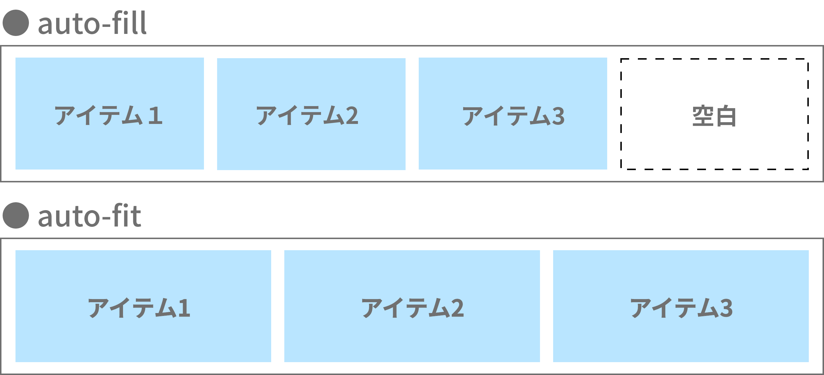
auto-fit と auto-fill の違い
- auto-fit:空トラックを 畳む → 見た目で空席が詰まる
- auto-fill:空トラックを 保持 → 見た目は空席のまま
どちらも repeat() と組み合わせるのが実戦的。
minmax() の役割(カードが潰れない最小幅)
- 定番は
minmax(180px, 1fr)。最小180〜220pxで調整すると崩れにくい。 - 子要素の
min-widthが強いとminmax()が効かないことがある。
●minmax指定のサンプルはこちら
https://sample.web-create-kokusyo.com/sample16/
よくある落とし穴(チェック)
- 子の
min-widthが原因でminmax()が効かない - 画像で高さがくずれる →
aspect-ratio/object-fitを併用 gapとmarginの混在で外周だけ広がる(外周は親のpaddingで)
実用レシピ(コピペ)
/* 3列固定+余白 */
.grid-3 {
  display: grid;
  grid-template-columns: repeat(3, 1fr);
  gap: 16px;
}

/* 自動折返し:カード潰れ防止(最小180px) */
.grid-cards {
  display: grid;
  grid-template-columns: repeat(auto-fit, minmax(180px, 1fr));
  gap: 16px;
}

/* 2カラム本文:本文広め(2:1) */
.article-2col {
  display: grid;
  grid-template-columns: 2fr 1fr;
  gap: 24px;
}

/* 最後の列だけ広くする */
.grid-last-wide {
  display: grid;
  grid-template-columns: 1fr 1fr minmax(220px, 2fr);
  gap: 16px;
} 調べても解決せず、学習が止まりがち