

スクロールしても背景の画像を固定したいよ~
「background-attachmen」プロパティを使用すれば簡単に実現できるよ

背景固定のサンプル
まずは、背景を固定するという意味ですが、これは言葉では説明しづらいですね。
サンプルページを用意しましたのでまずはこちらをご覧ください。
https://sample.web-create-kokusyo.com/sample01/
サンプルを見ると、背景画像はスクロールしても動いていません。
隙間から除く画像がオシャレですよね。
こういうのをパララックス(視差効果)って言ったりもします。
Webサイトにおける表現方法で、スクロールに応じて要素を動かしたり、遠近感を与えるようなデザインのことで、今回の背景固定もその一つになります。
背景を固定するプロパティ
肝心の背景を固定する方法ですが、指定はすごく簡単で固定したい背景画像に「background-attachment: fixed」を指定しましょう。
下のコードはサンプルページのコードです。
<section></section>

<!-- 背景画像1 -->
<section class="bg01"></section>

<section></section>

<!-- 背景画像2 -->
<section class="bg02"></section>

<section></section>

<!-- 背景画像3 -->
<section class="bg03"></section>

<section></section>
section {
height: 300px;
background-color:rgb(104, 93, 84);
}
.bg01 {
background: url(./img01.jpg);
background-size: cover;
background-attachment: fixed;
}
.bg02 {
background: url(./img02.jpg);
background-size: cover;
background-attachment: fixed;
}
.bg03 {
background: url(./img03.jpg);
background-size: cover;
background-attachment: fixed;
}これだけです。 簡単ですね。
Safariに対応する方法
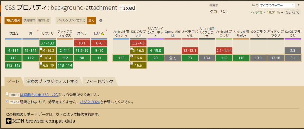
と ここまで解説してきた「background-attachment: fixed;」プロパティですが、残念なことにSafariに対応しておりません。
Can I useを見てみると下記の通り、safariは認識はするが効果がないと出てますね。
いつか対応はしてくれると思いますが、現時点では別の方法を考える必要があります。
背景画像が1枚の場合
背景が1枚の場合は簡単です。
「position: fixed」で背景を固定するだけです。
■サンプルページ
https://sample.web-create-kokusyo.com/sample01/index4.html

<!-- 固定する背景 -->
<p class="bg"></p>

<!-- テキストなどを入れるセクション -->
<section></section>

<!-- 画像を表示する隙間 -->
<section class="transparent"></section>

<section></section>

<section class="transparent"></section>

<section></section>

<section class="transparent"></section>

<section></section>
section {
height: 300px;
background-color:rgb(104, 93, 84);
position: relative;
z-index: 4;
}
/* 背景画像を表示する隙間 */
section.transparent {
background-color: transparent;
height: 300px;
}
/* 画像を背景に固定 縦横の幅は100%で全画面表示 */
.bg {
background: url(./img01.jpg);
background-size: cover;
background-attachment: fixed;
position: fixed;
width: 100%;
height: 100%;
top: 0;
left: 0;
}背景画像が複数の場合
背景画像が一枚の場合は簡単ですが、これが各セクションで表示する画像を変えるなど、複数の背景画像がある場合は面倒です。
「position: fixed;」で固定したところで表示されるのは、一番手前の画像だけです。
複数の背景画像を表示したい場合は、jsを使用する必要があります。
2パターンの方法を考えましたのでご紹介します。
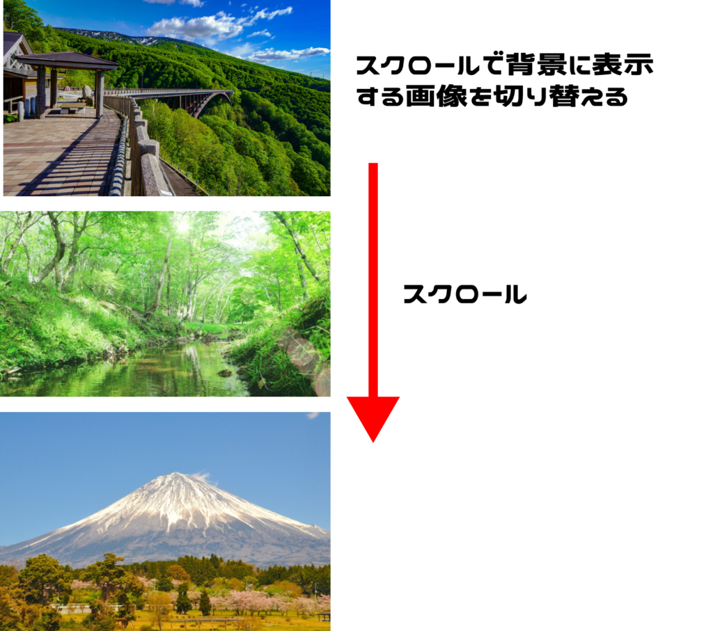
画面に一つの背景のみ表示するパターン
一度に画面に表示される背景が1つの場合は、スクロールで背景を切り替えることで表現できます。
下記サンプルはセクション間を100vhにしているので常に表示される背景は一つになります。
■サンプルページ
https://sample.web-create-kokusyo.com/sample01/index3.html
<!-- 固定する背景 -->
<p class="bg bg01"></p>

<section></section>

<!-- 画像を表示する隙間 -->
<section class="transparent"></section>

<!-- このセクションまでスクロールしたら画像を2枚目に変更 -->
<section id="img02"></section>

<section class="transparent"></section>

<!-- このセクションまでスクロールしたら画像を3枚目に変更 -->
<section id="img03"></section>

<section class="transparent"></section>

<section></section>
section {
height: 100vh;
background-color:rgb(104, 93, 84);
position: relative;
z-index: 4;
}
section.transparent {
background-color: transparent;
height: 300px;
}
/* 背景を固定 */
.bg {
position: fixed;
width: 100%;
height: 100%;
top: 0;
left: 0;
}
/* クラスで表示する画像を切り替える */
.bg01 {
background: url(./img01.jpg);
background-size: cover;
background-attachment: fixed;
}
.bg01.bg02 {
background: url(./img02.jpg);
background-size: cover;
background-attachment: fixed;
}
.bg01.bg02.bg03 {
background: url(./img03.jpg);
background-size: cover;
background-attachment: fixed;
}// 固定する背景を取得
const bg = document.querySelector(".bg");
// 画像を切り替えるセクションを取得
const img2 = document.getElementById("img02");
const img3 = document.getElementById("img03");
// スクロールイベントを設定
document.addEventListener("scroll", function () {
// 画像切り替えのセクションが画面上部に来たらクラスを付与して、画像を切り替える
if(img2.getBoundingClientRect().top < 0) {
bg.classList.add("bg02");
if(img3.getBoundingClientRect().top < 0) {
bg.classList.add("bg03");
} else {
bg.classList.remove("bg03");
}
} else {
// スクロールを戻したらクラスを外して画像切り替え
bg.classList.remove("bg02");
}
});画面に複数の背景を表示するパターン
画面に複数の固定背景がある場合は、上記の方法は使えません。
そこで一つ方法を考えましたので紹介します。
調べた限りは私のオリジナルだと思いますので、どうぞお試しください。
■サンプルページ
https://sample.web-create-kokusyo.com/sample01/index2.html
サンプルページのJSのイメージは下記の通りです。
全ての画像を「position:fixed」で固定しますが、スクロールに合わせて画像の高さを増減します。
<!-- これをワンセットとします -->
<article>
    <section></section> <!-- 茶色の部分 -->
    <section class="transparent"></section> <!-- 画像を表示する隙間 -->
    <p class="bg"><img src="./img01.jpg" alt=""></p> <!-- 背景画像 -->
</article>
<!-- これをワンセットとします -->

<article>
    <section></section>
    <section class="transparent"></section>
    <p class="bg bg2"><img src="./img02.jpg" alt=""></p>
</article>

<article>
    <section></section>
    <section class="transparent"></section>
    <section></section>
    <p class="bg bg3"><img src="./img03.jpg" alt=""></p>
</article>
section {
height: 300px;
background-color:rgb(104, 93, 84);
position: relative;
z-index: 4;
}
.transparent {
background-color: transparent;
}
/* 背景画像の重なり順を指定 */
.bg {
position: fixed;
top: 0;
left: 0;
margin: 0;
z-index: 3;
overflow: hidden;
}
.bg.bg2 {
z-index: 2;
}
.bg.bg3 {
z-index: 1;
}
img {
width: 100vw;
height: 100vh;
object-fit: cover;
}// 画像とセクションのセット部分を取得
const section = document.querySelectorAll("article");
// 固定する背景画像の一覧を取得
const img = document.querySelectorAll(".bg");
// 画面の高さ取得
let wh = window.innerHeight;
// 画面呼び出し時にも実行
calHaight();
// スクロールイベント
document.addEventListener("scroll", function () {
calHaight();
});
function calHaight() {
//背景画像全てに処理実行
for (let i = 0; i < section.length; i++) {
画面内に背景画像を表示するセクションが何割表示されているかを計算
let total = (section[i].getBoundingClientRect().bottom + 150) / wh;
if(total > 0) {
// 0 より大きければ 画像に高さを設定する
img[i].style.height = (total * 100) +"vh";
} else {
img[i].style.height = 0;
}
}
}以上 背景を固定する方法でした。
早くSfariが「background-attachmen」に対応してくれたらいいんですが。。
 調べても解決せず、学習が止まりがち